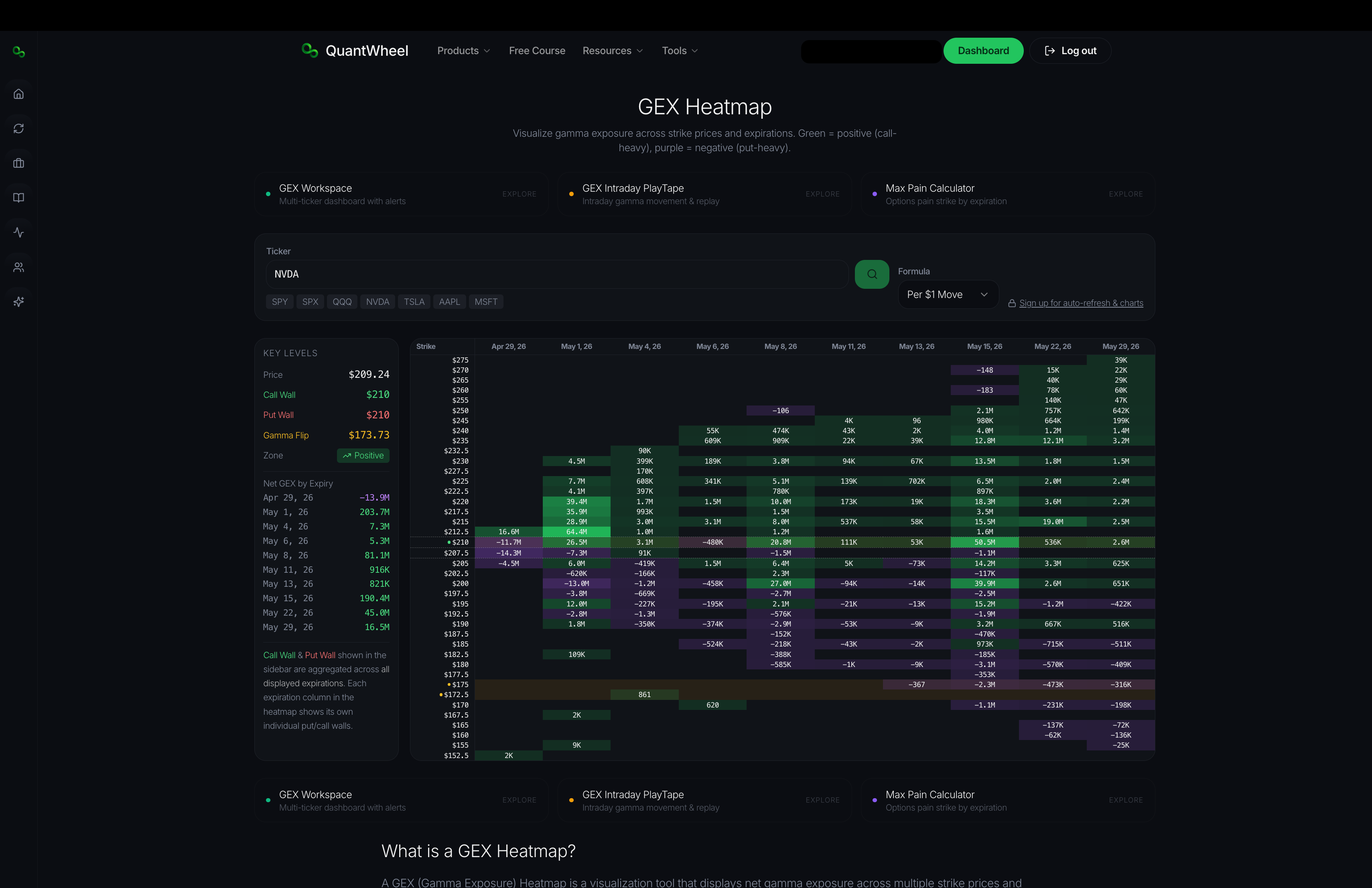
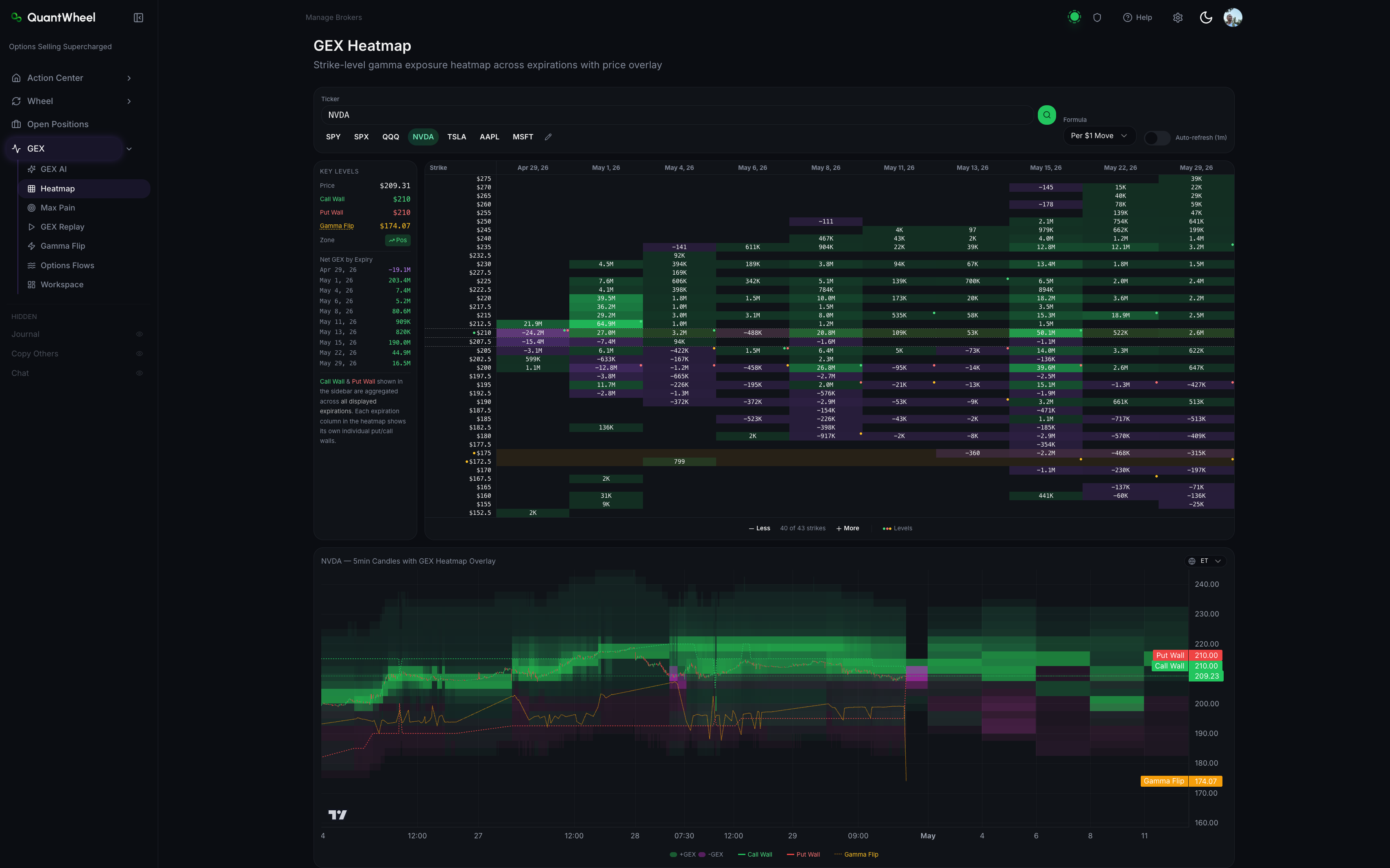
The Free GEX Heatmap shows gamma exposure across strikes and expirations as a 2D color-coded map. Where the Free GEX Calculator gives you summary numbers, the heatmap shows the shape — where dealer positioning concentrates, how it varies across the term structure, and which strike-expiration combinations carry the most weight.
Free to use. No account required.
What this tool does
The heatmap lays out a grid:
- Vertical axis (strikes) — typically 30-40 strikes centered on current price
- Horizontal axis (expirations) — nearest expiration on the left, farther expirations to the right
- Color intensity — the magnitude of gamma exposure at each strike-expiration cell. Brighter = more gamma.
- Color sign — positive call gamma and negative put gamma use different color scales, so direction is readable at a glance
A candlestick price chart typically sits below the heatmap with horizontal lines overlaid at the Call Wall, Put Wall, and Gamma Flip levels — connecting the positioning data to current price action.
How it looks within QuantWheel if you decide for one of the subscriptions:\
Who it's for
Traders who want to read market structure visually. The heatmap is especially useful for:
- Spotting clusters of dealer positioning at specific strike-expiration combinations
- Comparing the term structure — is positioning concentrated near-term or spread across expirations?
- Identifying ranges — if two strikes close together have heavy gamma, price often trades between them
- Understanding where resistance or support has structural backing vs. where it's thin
How to use it
- Enter a ticker — works best on liquid, heavily-optioned names
- Wait for the heatmap to render — a few seconds for data to load
- Scan horizontally across a single strike to see how gamma at that strike varies across expirations
- Scan vertically in one expiration to see which strikes concentrate gamma
- Cross-reference with the price chart below to see where current price sits relative to the hot zones
Reading the heatmap
Bright clusters near current price mean dealer hedging is active. Expect price behavior to respect the cluster's boundaries — supports and resistances within the bright zones are reinforced by hedging.
Thin or pale zones mean dealer hedging has less constraint on price. Moves can be larger and more directional when price drifts into thin zones.
Bright cells far from current price represent "what happens if" scenarios. If price were to move there, dealer hedging would become active — sometimes accelerating the move, sometimes resisting it depending on the positioning.
Limitations of the free version
The Free Heatmap gives you a snapshot. For active trading you typically want:
- Auto-refresh during market hours so the heatmap updates as positioning shifts
- Historical replay to scrub through past sessions
- Multi-ticker workspaces to compare SPY, QQQ, and single names side-by-side
- AI commentary that interprets the heatmap's structure
- Integration with alerts on specific levels
These live in QuantWheel's authenticated GEX Heatmap with the full workflow.
Related tools
- Free GEX Calculator — the summary-number version of the same data
- Free Max Pain Calculator — a related but distinct calculation for expiration pin levels
- How to read the GEX Heatmap — deeper guide for the authenticated version